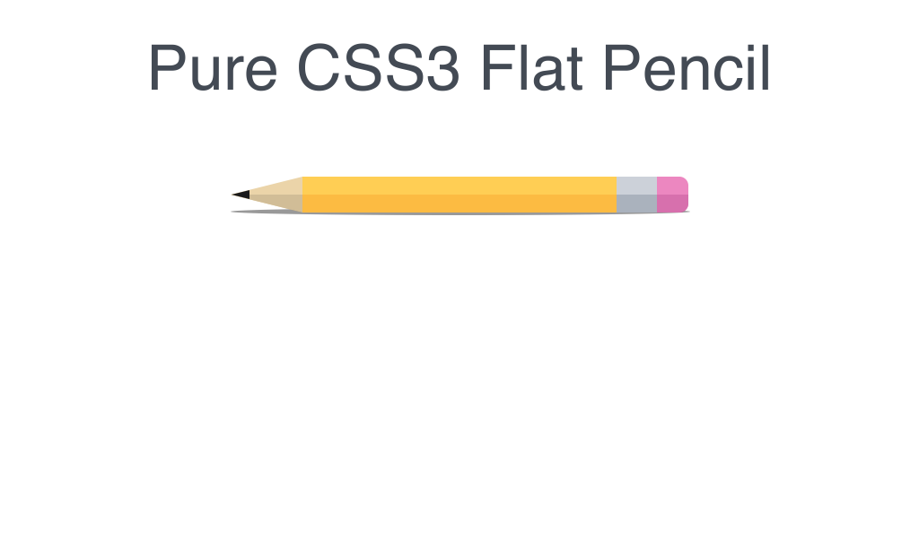
纯CSS3铅笔
HTML代码
1 2 3 4 5 6 7 8 9 10 | <link href='http://fonts.googleapis.com/css?family=Mr+Dafoe' rel='stylesheet' type='text/css'> <h1>Pure CSS3 Flat Pencil</h1> <div class="pencil"> <div class="eraser"></div> <div class="ferrule"></div> <div class="shaft"></div> <div class="lead"></div> </div> |
CSS代码
1 2 3 4 5 6 7 8 9 10 11 12 13 14 15 16 17 18 19 20 21 22 23 24 25 26 27 28 29 30 31 32 33 34 35 36 37 38 39 40 41 42 43 44 45 46 47 48 49 50 51 52 53 54 55 56 57 58 59 60 61 62 63 64 65 66 67 68 69 70 71 72 73 74 75 76 77 78 79 80 81 82 83 84 85 86 87 88 89 90 91 92 93 94 95 96 97 98 99 100 101 102 103 104 | h1 { text-align: center; font-family: helvetica; font-size:70px; color: #434A54; font-weight:lighter; } .pencil { width:40px; margin:-200px auto; transform:rotate(90deg); -ms-transform:rotate(90deg); /* IE 9 */ -webkit-transform:rotate(90deg); /* Safari and Chrome */ } .pencil:before { content: ""; position: absolute; height:512px; width:8px; background: rgba(0,0,0,.4); border-radius: 50%; margin-left:35px; margin-top:-2px; } .pencil .eraser { height:35px; width:40px; background: #EC87C0; -webkit-border-top-left-radius: 10px; -webkit-border-top-right-radius: 10px; -moz-border-radius-topleft: 10px; -moz-border-radius-topright: 10px; border-top-left-radius: 10px; border-top-right-radius: 10px; } .pencil .eraser:before { content: ""; position: absolute; width:20px; height:35px; margin-left:20px; background: #D770AD; -webkit-border-top-right-radius: 10px; -moz-border-radius-topright: 10px; border-top-right-radius: 10px; } .pencil .ferrule { height:45px; width:40px; background: #CCD1D9; } .pencil .ferrule:before { content: ""; position:absolute; height:45px; width:20px; margin-left:20px; background: #AAB2BD; } .pencil .shaft { height:350px; width:40px; background: #FFCE54; } .pencil .shaft:before { content: ""; position: absolute; height: 350px; width: 20px; margin-left: 20px; background: #FCBB42; } .pencil .lead { border-left: 20px solid transparent; border-right: 20px solid transparent; border-top: 80px solid #EBD4A9; } .pencil .lead:before { content: ""; position: absolute; margin-top: -80px; border-right: 20px solid transparent; border-top: 80px solid #D1BD97; } .pencil .lead:after { content: ""; position: absolute; margin-top:-21px; margin-left:-5px; border-left: 5px solid transparent; border-right: 5px solid transparent; border-top: 20px solid #1A1A1A; } |